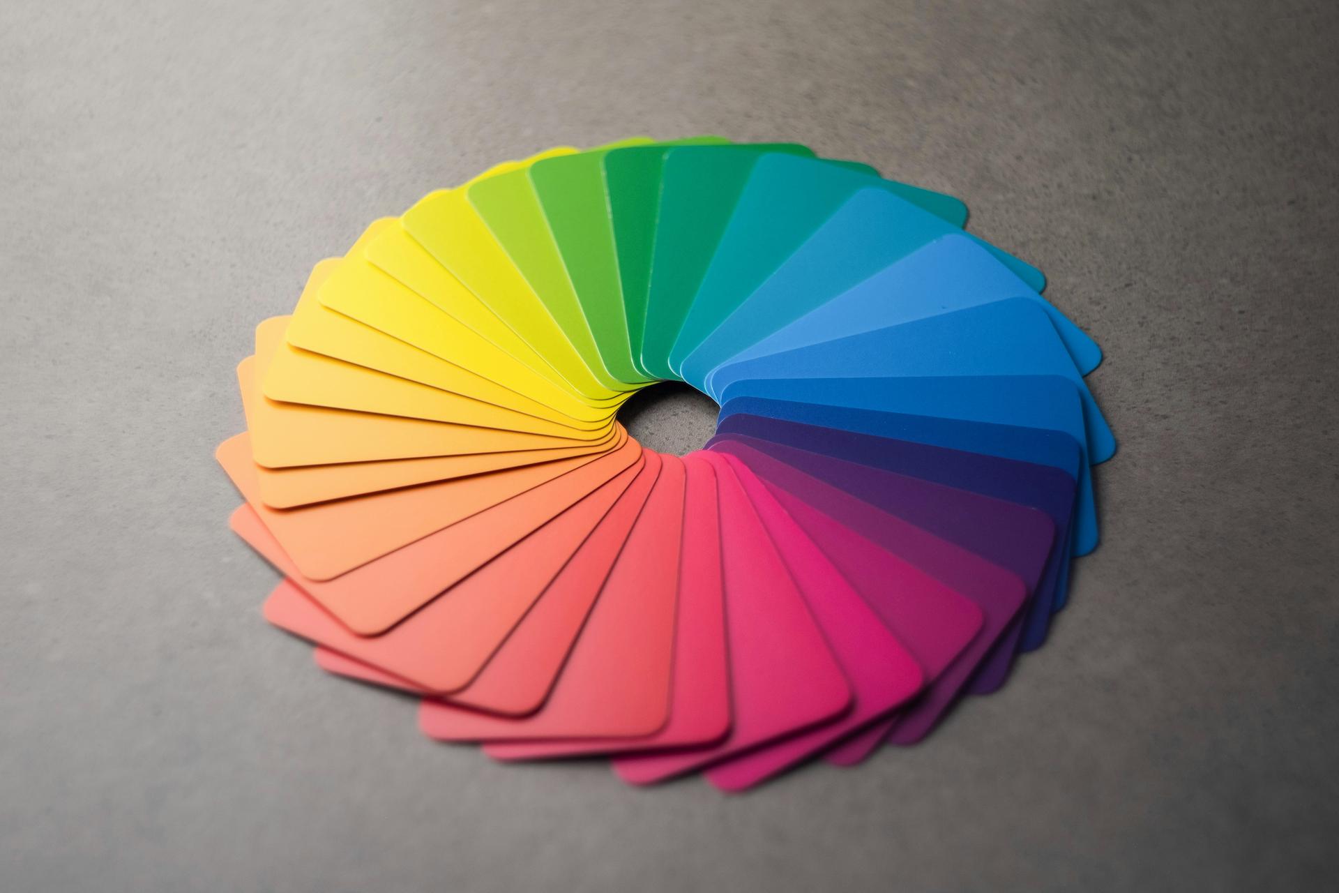
Colour psychology plays a huge role in event design, significantly impacting how attendees perceive and interact with their environment. When you carefully select a colour scheme, it can guide behaviour, evoke emotions, and create a memorable experience, setting the tone for the event. By utilising the colour wheel, event designers can harness the power of warm and cool tones, shades, and hues to influence mood and engagement. Warm colours, like reds and oranges, stimulate energy and excitement, while cool colours, such as blues and greens, promote calmness and tranquillity. When you understand these psychological effects, you can craft environments that not only fulfil aesthetic objectives but also enrich the emotional experiences of attendees. Whether it’s a corporate gathering, wedding, or festival, the thoughtful application of colour can transform an event, leaving a lasting impression on participants.
Colour Psychology in Event Design
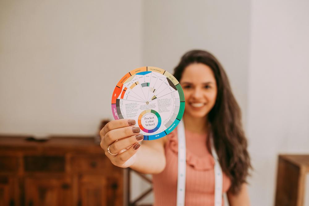
Colour plays a pivotal role in shaping event experiences, subtly guiding attendees’ perceptions and interactions within the space. Incorporating colour thoughtfully can enhance visual interest and establish a sense of order. A well-chosen palette can prevent feelings of anxiety or boredom, ensuring that the event environment is both inviting and stimulating. The colour wheel, which includes warm and cool tones, shades, tints, and hues, serves as a valuable tool in understanding the relationships between colours and their potential impact.
Psychological Impact of Colours
The psychological effects of colour are profound, with each hue capable of triggering specific emotional responses. Knowing these associations is key to leveraging colour psychology in event design. For instance, red is a powerful colour linked to passion, energy, and even danger. It can elicit a physical response, such as an increased heart rate, making it suitable for events that aim to energise and captivate the audience.
Orange, with its associations of courage and enthusiasm, is perfect for events that encourage networking and interaction. Yellow, often linked to happiness and warmth, can uplift spirits but should be used sparingly to avoid overwhelming attendees. Green, synonymous with nature and health, promotes a sense of balance and harmony, creating a peaceful atmosphere conducive to relaxation and reflection.
Blue is renowned for its calming properties, offering a sense of security and tranquillity. It can help reduce stress and lower heart rates, making it an excellent choice for events focused on wellness or meditation. Purple, associated with luxury and creativity, can inspire imagination and is particularly effective in settings that encourage innovation and interactive participation.
While perceptions of colour can be subjective, certain associations appear to have universal qualities. For example, a study conducted in 2020 highlighted that people often link specific colours with particular emotions, suggesting that these connections may transcend cultural differences. However, it’s important to consider factors such as age and cultural background, as these can influence individual responses to colour.
The mood-altering effects of colour, though potentially temporary, can significantly shape the atmosphere of an event. By carefully selecting and combining colours, event designers can craft an environment that not only conveys information but also influences decisions and leaves a lasting impression on attendees.
Colour Schemes and Their Effects
In the realm of event design, the thoughtful application of colour can greatly shape the atmosphere and emotional reactions of attendees. By understanding the psychological implications of various colour schemes, designers can cultivate the desired ambiance and enhance the overall experience.
Warm Colours and Their Emotional Influence
Warm colours, including red, orange, and yellow, are recognised for their capacity to elicit strong feelings and energise a space. These shades are often linked to comfort and excitement. Red, in particular, is a dynamic colour that can elevate the energy in a room. While it is associated with passion and love, it can also convey intensity and anger. In event contexts, red is effective for fostering a vibrant and engaging environment, making it suitable for social and entertainment-focused areas.
Orange, another lively warm hue, embodies enthusiasm and vitality. It can invigorate a setting, promoting social interaction and a sense of community. Yellow, the most cheerful of the warm colours, is connected to happiness and creativity, stimulating mental engagement and inspiring positivity. These warm tones are especially beneficial in spaces designed for interaction, such as dining areas or networking zones.
Cool Colours and Their Calming Effect
Cool colours, such as blue, green, and purple, are often employed to establish a tranquil and soothing atmosphere. These shades are associated with relaxation, making them ideal for environments where peace is a priority. Blue is particularly noted for its calming effects and is frequently utilised in settings aimed at promoting relaxation and introspection. It helps attendees feel more at ease, making it suitable for areas designated for rest or contemplation.
Green, closely associated with nature, is refreshing and balanced. It can elevate mood and foster a sense of renewal, making it an excellent choice for spaces that encourage rejuvenation. Lighter shades of purple, like lavender, can evoke optimism, while deeper tones may convey luxury and power. These cool colours are well-suited for creating serene environments that promote relaxation and reflection.
Neutral Colours and Their Versatility
Neutral colours, such as brown, grey, and white, provide flexibility and balance in event design. Brown, a warm and grounding shade, evokes safety and stability, complementing more vibrant colours effectively. Grey, the most neutral option, is linked to sophistication and modernity, offering a calming backdrop that allows other colours to shine without overwhelming the senses.
White, often associated with purity and new beginnings, can create a sense of spaciousness and openness. It has a decluttering effect that can enhance creativity and organisation. Neutral colours are essential in event design for their ability to harmonise with more intense shades, creating a cohesive environment. They serve as a versatile canvas that can adapt to various themes and moods, making them an important element of any colour scheme.
Practical Applications in Different Event Types
Corporate Events and Colour Branding
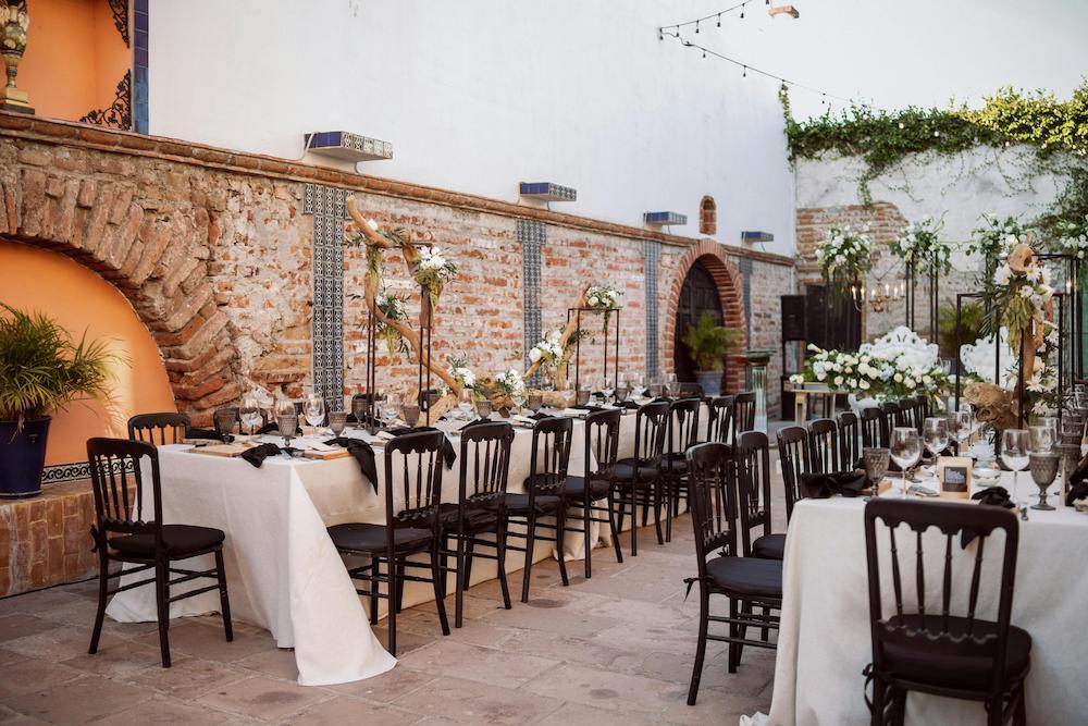
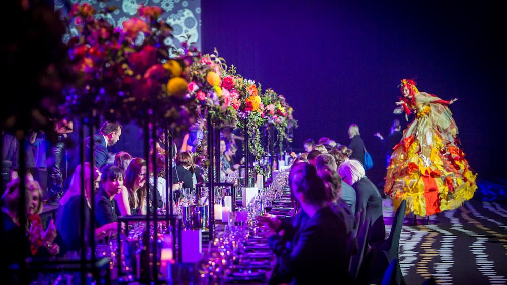
In corporate events, the intentional selection of colour can greatly impact the atmosphere and audience perception. Colour schemes serve not just as decoration but as essential components of branding and messaging. For example, a formal event may utilise traditional colours like black, white, and gold to express elegance, while a more relaxed networking gathering might incorporate lively shades such as yellow and orange to foster interaction among guests.
It’s important for the chosen colours to complement the venue’s existing decor to create a cohesive visual experience.
Consistency in colour usage across all event elements—from invitations and signage to lighting and table settings—strengthens brand identity and enhances the overall experience for attendees.
Additionally, integrating the brand’s colour palette into every aspect, including logos and promotional materials, builds familiarity and reinforces brand recognition.
Colour also plays a role in establishing the event’s mood. Darker, cooler shades like navy or black can evoke professionalism, while brighter, warmer tones can generate excitement. The strategic use of lighting, such as soft uplighting, can add an element of intrigue, particularly in product launches where making a memorable impression is vital.
Weddings and Personal Events
In weddings and personal celebrations, colour psychology significantly influences the emotional experience. For instance, red is often associated with passion and romance, adding a dramatic flair to ceremonies. Green, representing balance and new beginnings, is frequently used in floral arrangements or favours to convey best wishes for a fresh start. Blue, known for its calming properties, can help alleviate pre-wedding jitters, fostering a serene environment. Purple, linked to creativity and charm, can introduce an element of luxury, making it suitable for significant life celebrations.
Festivals and Community Gatherings
Festivals and community events provide an excellent platform to explore the dynamic world of colour psychology. These gatherings often aim to create an energetic and inclusive environment, where colour can enhance a sense of community and shared experience. Bright and bold colours, such as orange and yellow, are particularly effective in these contexts, as they evoke warmth, excitement, and optimism.
Colour can also highlight specific themes or cultural elements within a festival. Incorporating traditional colours associated with particular cultures can enrich the authenticity of the event. Furthermore, the strategic application of colour in signage, decorations, and lighting can help guide attendees through the space, ensuring a seamless and enjoyable experience.
Tailoring Colour Choices to Audience Preferences
Cultural Sensitivities and Colour
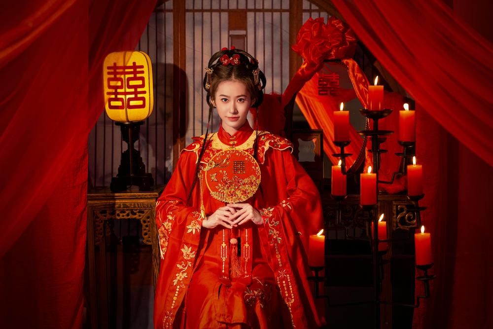
When planning events, it is essential to understand the cultural implications of colours, as they can have different meanings across various societies. For example, while red symbolises good fortune in countries like China and Argentina, it may represent misfortune in places such as Germany and Nigeria. Similarly, white is associated with purity in the United States but is linked to mourning in many East Asian cultures. Green also varies in interpretation; it can signify envy in the U.S. and Belgium, while in Malaysia, it may indicate danger. These cultural differences necessitate that event designers consider the backgrounds of their audience to ensure that the chosen colour palette is positively received and avoids negative associations.
Age Groups and Colour Perception
Age significantly influences how individuals perceive and prefer colours. As people grow older, their ability to differentiate certain colours, especially within the yellow-blue spectrum, may decline. This change can affect older adults’ interactions with their environment, potentially impacting their experience at events. Additionally, colour preferences shift throughout life; children are often drawn to bright, bold colours, while adults may lean towards more muted or sophisticated shades. By acknowledging these age-related preferences, event designers can create visually appealing environments that cater to all age groups, enhancing the overall experience for attendees.
Gender Considerations in Colour Selection
Gender can also play a role in colour preferences, with research indicating both notable and minimal differences between male and female choices. Traditionally, females have shown a preference for warmer colours, whereas males tend to favour cooler tones. Research indicates that women generally prefer reddish hues and are less inclined towards greenish-yellow shades compared to men. These preferences may stem from both biological factors and societal norms that associate certain colours with specific genders.
Challenges and Solutions in Colour Implementation
Limitations in Venue Design
One of the main obstacles in applying colour psychology in event design is the constraints set by the venue itself. Many locations come with established colour schemes and architectural features that can limit the options available to designers. This can create challenges in aligning the event’s colour strategy with its branding and thematic objectives. For example, a venue dominated by red tones may conflict with a brand’s blue-focused palette, potentially undermining the message of stability and success typically associated with blue.
To navigate these challenges, designers can creatively utilise lighting to alter the space. Architectural lighting can introduce new hues and atmospheres, providing more flexibility in design choices. Soft, diffused lighting can enhance the ambiance, which is particularly beneficial in product launches where creating a memorable environment is essential. Additionally, using decorations that either complement or contrast with the venue’s existing colours can help achieve the desired aesthetic without overwhelming the space.
Balancing Trends with Timelessness
Another challenge in colour implementation is finding the right balance between contemporary trends and enduring design principles. While it may be appealing to incorporate the latest colour trends to give an event a modern feel, these choices can quickly become outdated. Conversely, relying solely on classic colour schemes may fail to engage a modern audience.
A viable approach is to merge trendy colours with timeless elements. For instance, employing a monochromatic scheme accented by a trendy colour can create a striking yet sophisticated appearance. High-contrast combinations can draw attention to key visual elements, ensuring they stand out while maintaining a cohesive design. By understanding the psychological effects of colours, such as the soothing nature of analogous combinations like blue, teal, and green, designers can create an experience that feels both contemporary and lasting.
Measuring Success of Colour Choices
Evaluating the effectiveness of colour choices in event design can be intricate, as it encompasses both subjective and objective criteria. To assess success, event designers can collect feedback from participants, observing their reactions and levels of engagement. Testing visuals prior to the event can also provide valuable insights into how different colour schemes are received. This allows for necessary adjustments to ensure that the selected colours positively contribute to the overall experience. Furthermore, the effectiveness of colour choices can be gauged by their ability to convey the event’s purpose and enhance brand recognition. Consistent application of a brand’s colour palette across various elements, from signage to promotional items, can reinforce brand identity and leave a lasting impression on attendees.
Enhancing Event Experiences through Colour Psychology
Colour psychology is an indispensable tool in crafting memorable and meaningful events. By thoughtfully selecting and integrating colour schemes, designers can shape the emotional and psychological atmosphere, catering to diverse cultural, age, and gender preferences. From corporate gatherings to personal celebrations, the power of colour extends beyond aesthetics, acting as a bridge between brand messaging and audience connection. Overcoming venue limitations and balancing trends with timelessness are important steps in leveraging this tool effectively.
As an integral part of event design, colour influences behaviour, guides interactions, and enhances engagement. By understanding and applying these principles, event planners can create experiences that resonate on a deeper level, leaving a lasting impression long after the event concludes. Embracing colour psychology not only enriches the visual narrative but also elevates the overall event, making it truly unforgettable.

